Google Sheets is a powerful, cloud-based tool for managing and analyzing data. One of its most useful features is the ability to create graphs (also called charts) that visually represent your data, making it easier to interpret and share insights. Whether you’re working on a business report, a class project, or tracking personal data, creating a graph can transform raw numbers into a clear and compelling visual representation.
This guide will walk you through how to make a graph in Google Sheets step-by-step, from simple bar graphs to more advanced visualizations like pie charts, scatter plots, and line graphs.
Why Create Graphs in Google Sheets?
Before we dive into the details, let’s quickly look at why you might want to create a graph in Google Sheets:
- Visualization: Graphs make it easy to see trends, outliers, and patterns in your data at a glance.
- Presentation: A graph can be a powerful way to communicate your findings, especially in reports, presentations, or collaborative projects.
- Comparison: Graphs help compare data sets efficiently, whether you’re tracking monthly sales, comparing growth, or analyzing survey results.
- Automation and Accessibility: Google Sheets allows for real-time collaboration, and any changes to the data automatically update the graph, keeping your visuals current.
Types of Graphs You Can Create in Google Sheets
Google Sheets supports a variety of graph types:
- Bar Chart: Best for comparing quantities across categories.
- Line Chart: Ideal for showing trends over time.
- Pie Chart: Useful for illustrating percentages or parts of a whole.
- Scatter Plot: Great for showing correlations or distributions.
- Column Chart: Similar to a bar chart but with vertical bars.
- Area Chart: Like a line chart but with the area under the line shaded to show volume.
- Combo Chart: Mixes different chart types, such as bars and lines, in a single chart.
Step-by-Step Guide to Creating a Graph in Google Sheets
Here’s how you can create a basic graph in Google Sheets using different types of data:
Step 1: Enter Your Data in Google Sheets
Before creating a graph, you need to input your data into Google Sheets. The structure of your data will depend on the type of chart you’re creating. For instance:
- Bar/Column Chart: Data categories in one column and values in another.
- Line Chart: Dates or time periods in one column and values in another.
- Pie Chart: A category in one column and percentage in another.
Example of data structure for a basic bar chart:
| Month  | Sales |
|--------|-------|
| January| 500   |
| February| 600  |
| March  | 700   |
| April  | 850   |
Step 2: Highlight the Data Range
Once your data is entered, you need to select the cells that contain the data you want to visualize. Simply click and drag over the range of cells, or hold Shift while selecting different sections of your data.
Step 3: Insert a Chart
- With the data selected, go to the Insert menu at the top of the page.
- Choose Chart from the drop-down menu.
Google Sheets will automatically generate a chart based on your selected data. By default, it may create a column chart, but you can customize this.
Step 4: Customize Your Chart Type
Google Sheets may not always guess the best chart type for your data. Here’s how to change it:
- Once the chart appears, click on it to reveal the Chart Editor pane on the right.
- In the Chart Editor, click on the Setup tab.
- Under Chart Type, click the drop-down menu to see the available chart types. Select the one that best fits your data, like Bar chart, Line chart, Pie chart, etc.
Customizing Your Graph in Google Sheets
Creating a basic graph is just the start. To make your graph more useful and visually appealing, you can customize various elements in Google Sheets.
Step 5: Customizing Chart Elements
Once you’ve selected your chart type, it’s time to customize it:
a) Change Titles and Labels
- Go to the Customize tab in the Chart Editor.
- Click on Chart & Axis Titles.
- Enter a meaningful Chart Title that describes your data. You can also add or edit the axis titles under Horizontal and Vertical axis title.
b) Adjust Axis Settings
- In the Customize tab, scroll down to Horizontal Axis and Vertical Axis to adjust the range, labels, and scale of your axes.
- You can also change how the axis values appear by enabling Log Scale or Max/Min Values for better data representation.
c) Change Colors and Fonts
- To change the color of your chart elements, go to Chart Style under the Customize tab.
- Here, you can modify the background color, font style, and even the gridlines for a cleaner look.
d) Adding Data Labels
- If you want to display the actual values on each bar, line, or section, you can enable Data Labels.
- Under Series in the Customize tab, check the box labeled Data labels.
e) Modify Gridlines and Ticks
- Under the Customize tab, select Gridlines and Ticks to adjust how many gridlines are shown. This can help emphasize specific values on your graph or declutter the visualization.
Advanced Chart Types and Features
Google Sheets also offers advanced features and additional graph types for more complex data analysis.
Step 6: Creating a Pie Chart
- Highlight the data for your pie chart. Typically, a pie chart uses two columns: one for the category and one for the corresponding values.
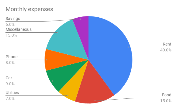
- Insert a chart as before and then change the Chart Type to Pie chart in the Chart Editor.
Pie charts are great for visualizing parts of a whole, but they can become cluttered with too many data points. Make sure to limit the number of segments for readability.
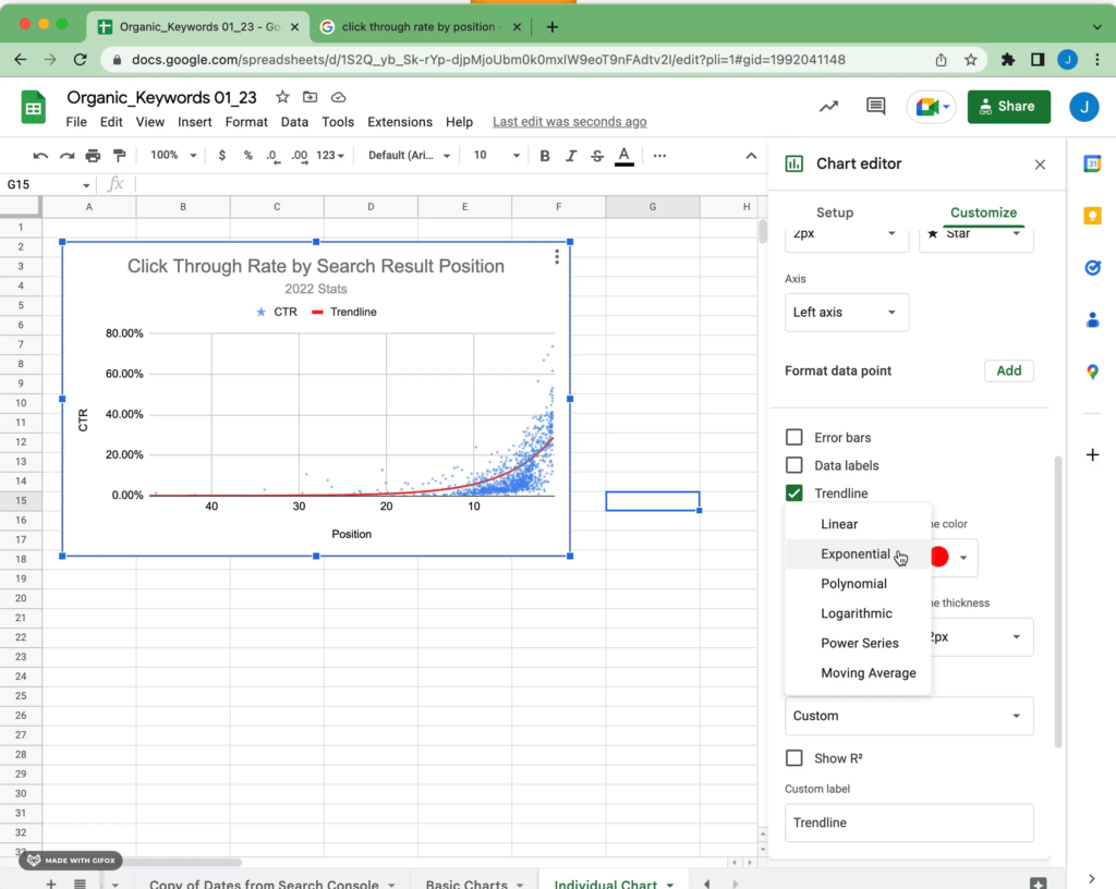
Step 7: Creating a Scatter Plot
A scatter plot is useful when you want to explore the correlation between two sets of data.
- Highlight your two data sets (e.g., height and weight).
- Insert a chart and choose Scatter chart under Chart Type.
- Customize the chart to add trendlines or highlight specific data points under the Customize tab.
Step 8: Creating a Combo Chart
A combo chart allows you to combine two different chart types. For instance, you can display bars for sales and a line to show profit margins in one graph.
- Select your data.
- Insert a chart and change the Chart Type to Combo chart.
- Customize each data series to use either a bar, line, or area chart under Series in the Customize tab.
How to Update and Edit Your Graph
One of the key advantages of Google Sheets is its real-time collaboration and ease of updating data:
- Automatic Updates: When you edit the underlying data, the graph will automatically update to reflect those changes.
- Edit Graph Features: Click on the graph at any time to reopen the Chart Editor. Here, you can change the chart type, data range, labels, and more.
Sharing and Embedding Your Graph
Once you’ve created and customized your graph, you can easily share or embed it:
Step 9: Sharing the Graph
- Click the three dots at the top-right corner of the chart.
- Choose Copy chart or Publish chart to create a shareable link.
- You can also copy the chart and paste it into Google Docs or Slides.
Step 10: Embedding the Graph
- If you want to embed your graph on a website or blog, click the three dots and select Publish to the web.
- You’ll get a code that you can use to embed the graph in HTML format.
Conclusion
Creating a graph in Google Sheets is a straightforward process that allows you to turn raw data into meaningful insights. Whether you’re using simple bar charts or advanced combo graphs, Google Sheets offers all the tools you need to customize and share your visualizations.
By following this step-by-step guide, you’ll be able to create professional-looking graphs that enhance your data analysis and improve communication in your reports or presentations.